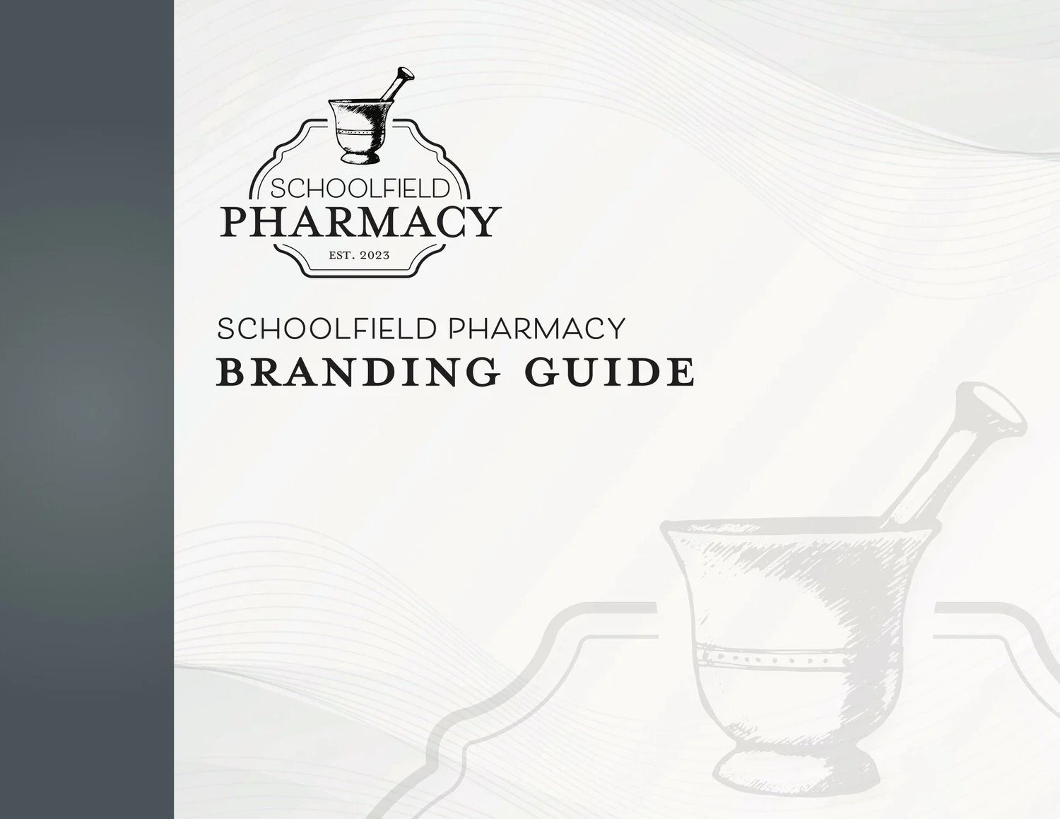
Schoolfield Pharmacy, A Modern Boutique Pharmacy

Add captions to images to improve your SEO!
When Dr. Riley Schoolfield, started Schoolfield Pharmacy, she knew exactly one thing for sure, she wanted a brand that felt professional, personal, and thoughtfully made. She wanted a designer she could trust, someone who would build the brand from the ground up and treat it with the same care she brings to her business every day.
Schoolfield Pharmacy started with nothing in place, no logo, no colors, no fonts, no visual direction. We began exactly where I love to start, with conversation. We talked through who she is, how she works, and what kind of experience she wanted patients to feel the moment they saw the building or stepped inside.
This is a boutique pharmacy, clean, bright, and modern, with white interiors, black scrubs worn by the team, and a chandelier that adds an unexpected softness to the space. The style leaned industrial and modern, but still warm. While she and her husband own a farm and originally considered incorporating a farm element into the logo, we made the intentional choice not to lean too far in that direction. A pharmacy needed to read clearly as a pharmacy. Instead of literal farm imagery, I introduced a subtle rustic texture and overlay to quietly nod to their roots without confusing the brand.
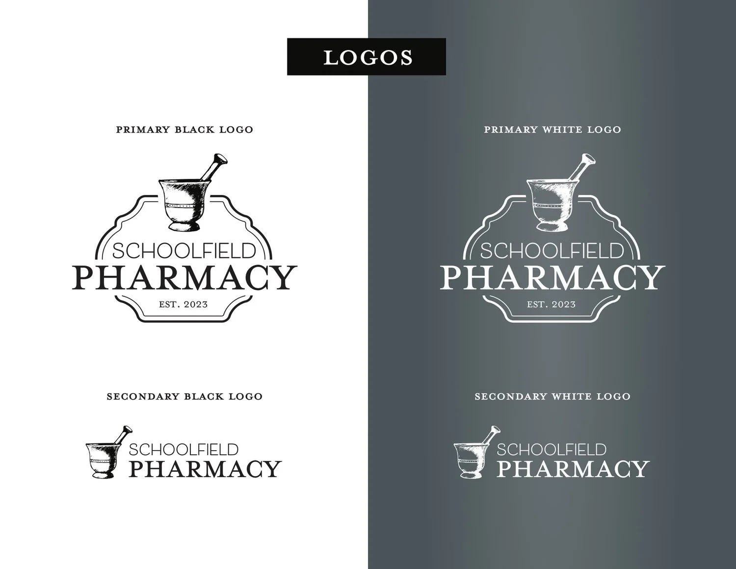
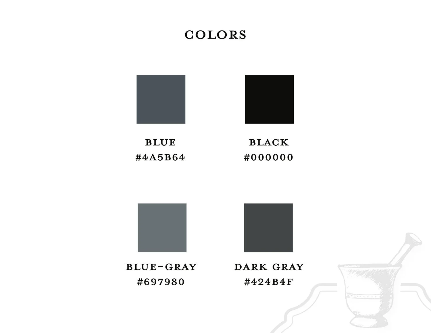
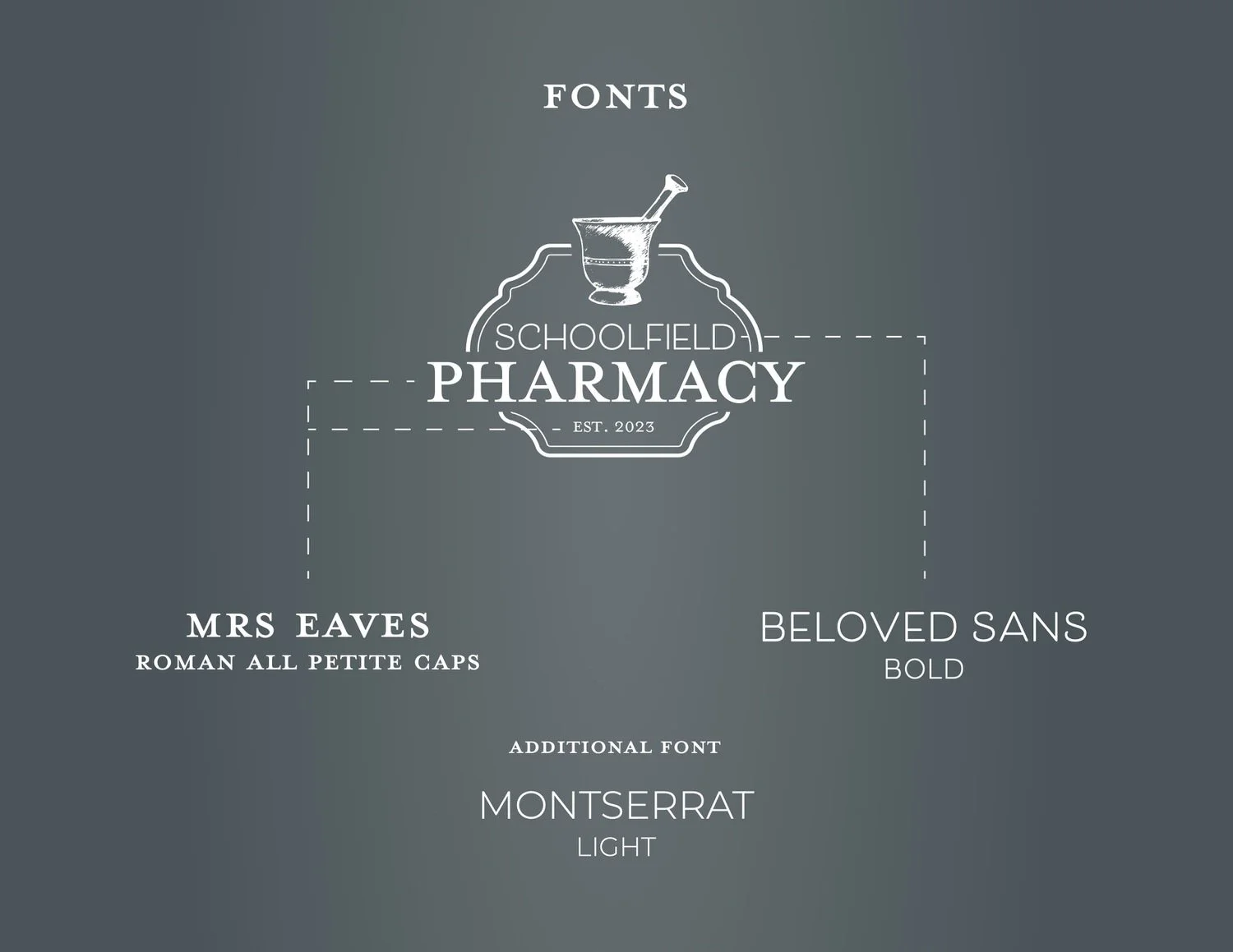
From there, we built the foundation, starting with the logo. The mark needed to feel strong, trustworthy, and timeless, something that would look just as good on a storefront sign as it would on prescription packaging or a website header. Once the logo was established, we narrowed in on the color palette and typography. Deep blue tones, layered grays, and classic black created a grounded, professional feel, while the font pairing balanced structure with approachability.
Every piece of the brand was designed to work together seamlessly, from the logo variations to the colors, fonts, and textures. Once the branding was complete, it was applied across the website and social media, which fully reflects the look and feel we created. The result is a brand that feels cohesive, intentional, and distinctly theirs.
Schoolfield Pharmacy is a perfect example of why custom branding matters. This was not about following trends or choosing something quick. It was about creating a visual identity that matched the level of care, professionalism, and pride behind the business. One built thoughtfully, from scratch, with room to grow.